Improving your internal linking is a critical and easily overlooked optimization lever. Critical because it just makes sense from a user standpoint: helping users navigate the website and find related content and resources on your site increases the engagement to your brand.
Similarly, linking related content together helps crawlers to find and index all content in a cluster and signals to search engines the topical relevance of your website. In theory, you can expect a better link equity distribution to benefit your rankings.
Quick Introduction to Gephi
If you’re not familiar with Gephi, it’s a free and open-source visualization tool convenient for visualizing and analyzing networks of “nodes” interconnected with “edges”:
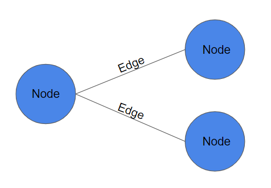
The nodes and edges can be whatever you want to analyze; in our case, nodes are pages, and edges are internal links between 2 pages.
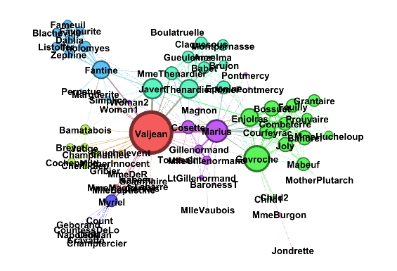
It produces cool and colorful charts that will impress your friends and family (see an example below with a chart of the coappearance weighted network of characters in the novel Les Miserables) but will also help you to analyze and solve complex problems that are not easy to picture otherwise.
You can download the latest version on the official website: Gephi.org
Collect and prepare the data
You will need to import two datasets:
- the edges table
- and the nodes table
The edges table requires two columns: Source, Target
We want to visualize the internal linking; any legit crawler will provide you with the data. In that case, I used Screaming Frog to crawl sections of websites and exported the internal link report: Bulk Export > Links > All Inlinks
I filtered the inlinks report to keep only the results with a status code = 200 and link position = Content so it removes any broken links and navigational links (more information about Link Position on SF website).
The nodes table requires only an Id column, created automatically with all the unique nodes gathered in your edges table, but we will be adding two data points to make things interesting:
- Template type
- Traffic
Note: because I’m looking at competitors, I’m guessing the template type based on the title tag and URL. The traffic is estimated by ahrefs. Use your own data when it’s possible, of course.
Export both files to a CSV format. Now the cool part:
Visualizing in Gephi
Import the edges table first using the “Import Spreadsheet” feature.
Same for the nodes table, on the next screen, you will want to pick “Append to the current workspace” instead of “Create a new workspace,” so both tables are in the same workspace.
*drum roll*
ok, not quite there yet… but I promise we will with a few easy tweaks.
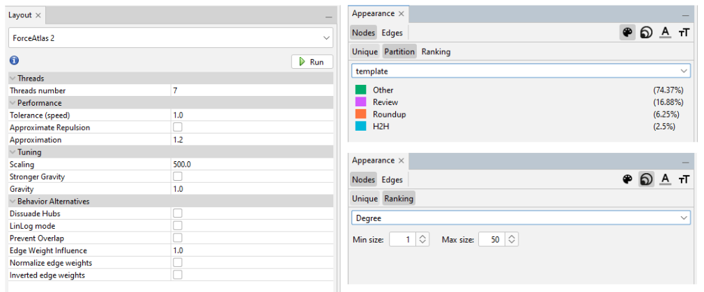
First, you will want to modify the layout and use “ForceAtlas 2”: a layout algorithm for force-directed graphs used to visualize networks, which is precisely what we’re doing. Play around with the settings, mainly “Scaling” and “Gravity” until your graph looks good. “Prevent Overlap” might help in some cases.
Next, the appearance.
For the size of the nodes, we will try two options that will give us a different perspective: traffic, or number of inlinks (Degree)
We’ll use the Template type data we collected for the color.
That’s it. Here’s a chart of the internal linking for the Life Insurance cluster on Forbes Advisor:
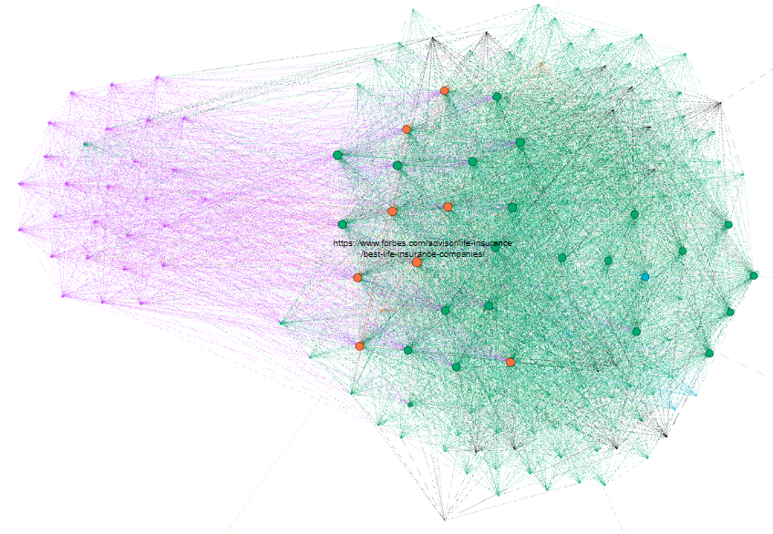
Fascinating to see how the template types seem to live on two different islands. The money-makers in orange (i.e. roundups) receive about the same amount of links (from the cluster) as most of the other pages. Even their most important page (i.e. “best life insurance”) barely gets more links than the others!
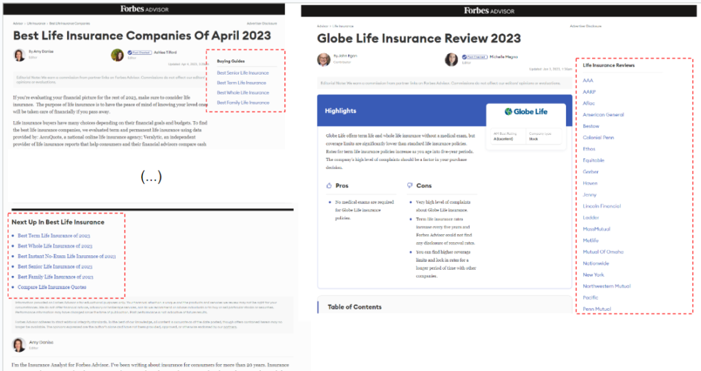
Looking at the website, it makes sense: they added a nav-like menu to feature the essential pages in the cluster. Screaming Frog caught it as a “content” link because in the main section. Thanks to the responsive design, it doesn’t disrupt the reading experience because it is in the right rail on desktop and goes to the bottom of the article on mobile.
Same cluster but another perspective: the node size is now the traffic (estimated by ahrefs):
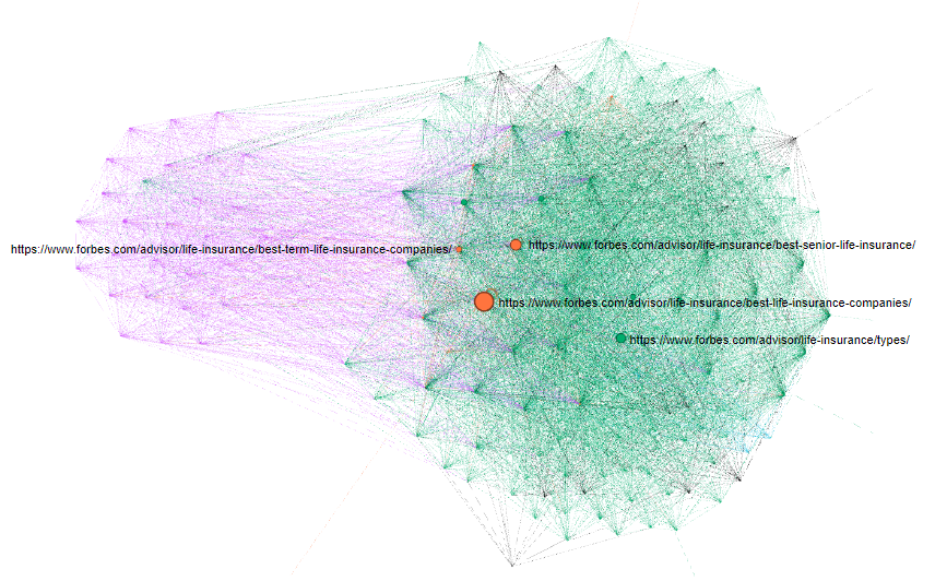
That view helps visualize if the most critical pages are well connected. Clean sheet for Forbes.
Another example: US News, node size = number of internal links.
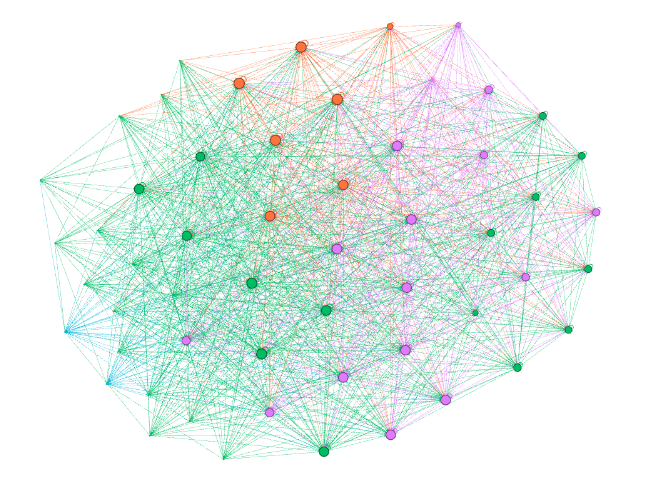
It looks nice and clean too! You would have a hard time guessing which is the most important page based on that chart only. Quite similarly to Forbes, they’re using a system of links within the main content to create that beautiful network: e.g. https://www.usnews.com/insurance/life-insurance
What about Nerdwallet?
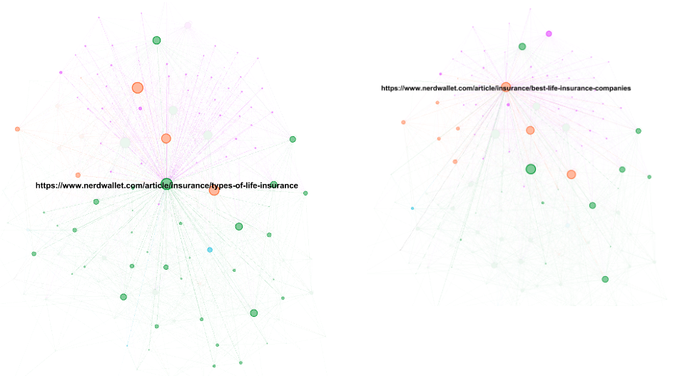
Some might be tempted to call it chaotic, but I say organic. The difference with the previous examples is fewer navigational links, and despite that, they’re doing a great job linking to their most important pages.
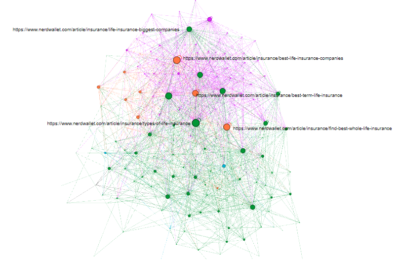
If you want more details, Gephi will let you click any node to check the details of the linking:
What is the optimal internal linking structure?
Now that we’ve seen a few examples, can we conclude if one is better than another? Not exactly, but it should give you an idea of whether or not you need to adjust yours.
An optimal linking structure serves the user the best. So, it will always depend on the context; on a complex YMYL topic like Life Insurance, for example:
I believe having a good distribution of links between transactional and educational content makes a lot of sense. I would also argue it’s beneficial for the user to be exposed to more targeted transactional content depending on what they’re looking for, so a good distribution between the main roundups is essential vs. linking massively to the one with the highest revenue.
Internal linking strategies usually stop at the domain (nav, categories etc.) and page (in-copy, recirc) levels; the cluster perspective will provide the best insights.
Visualizing the state and effects of something as abstract as link equity is incredibly helpful if you need to make a case to stakeholders, especially if the suggested optimizations have an impact beyond the cluster analyzed.
Was this helpful?
5 / 0

SEO/Data Enthusiast
I help international organizations and large-scale websites to grow intent-driven audiences on transactional content and to develop performance-based strategies.
Currently @ZiffDavis – Lifehacker, Mashable, PCMag
ex @DotdashMeredith, @FuturePLC